
Sometimes, it’s the smallest details that make a house feel like yours.
When we began renovating our old Andalucian townhouse, there were certain things we knew we wanted to retain, certain things we wanted to change, and a few things we simply weren’t prepared to compromise on. Light switches were one of them.
I’ve always loved traditional toggle switches. There’s something about their simplicity, their shape, the way they feel beneath your fingers. And in a house with so much history and character, ordinary white plastic switches just didn’t feel right. The house deserved something better.
I discovered Fontini while looking at different options online, and that was pretty much that.
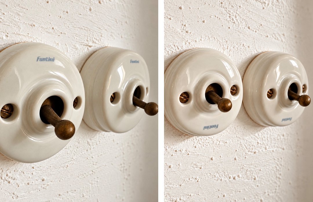
There were plenty of designs to choose from, but I kept coming back to the simplest. White ceramic, a brass toggle and the most beautiful, delicate pale-blue Fontini logo. Unfussy. Uncomplicated. Just beautiful. They weren’t inexpensive, particularly when you start counting how many switches a house actually needs. And ours needed quite a lot. Initially, we’d planned to have them fitted on the ground floor only. But after finding them through a Spanish electrical supplier at a better price, we decided to go a little further and use them throughout the house. I’m so pleased we did.
They’re lovely to look at, of course, but what I hadn’t fully appreciated was how tactile they would be. There’s a satisfying little clunk when you move the brass toggle. Nothing harsh or mechanical. Just a reassuring, deliberate movement. A tiny everyday pleasure. And when you think about how many times you turn a light on or off, those tiny pleasures add up.
Of course, this being a renovation, things didn’t go entirely to plan.
Some months after the switches had been fitted, I noticed that nine of them had their beautiful pale-blue Fontini logos upside down. Initially, I assumed the ceramic covers had simply been installed the wrong way round. Something we could easily put right. Except we couldn’t. When we removed one of the covers, we discovered a small channel cut into the ceramic. Turning the cover around would put the logo the right way up, but leave the channel clearly visible at the top. A little investigation, followed by an exchange of emails with the supplier, revealed the explanation.
I’d ordered the wrong switches…
Not entirely wrong, thankfully. They worked perfectly well. But I’d inadvertently ordered a version designed to accommodate surface-mounted electrical cables, complete with a little opening for the cable to pass through.We didn’t have surface-mounted cables. And the only way to conceal the opening was to fit the ceramic covers upside down. The supplier confirmed that replacement covers weren’t available separately. Putting things right would mean purchasing nine complete switches. By that stage of the renovation, we simply couldn’t justify the additional expense. Not for something that worked perfectly well and looked beautiful in every other respect. So we left them.
And I’m still delighted with our choice. The switches are exactly what I’d imagined for the house, and I’d choose them again without hesitation. Although I’d pay rather more attention to the product references next time, as nine of our switches still have their little pale-blue logos upside down.
Nobody else has ever noticed. But I notice every single time. Perfect imperfection…
0 Comments